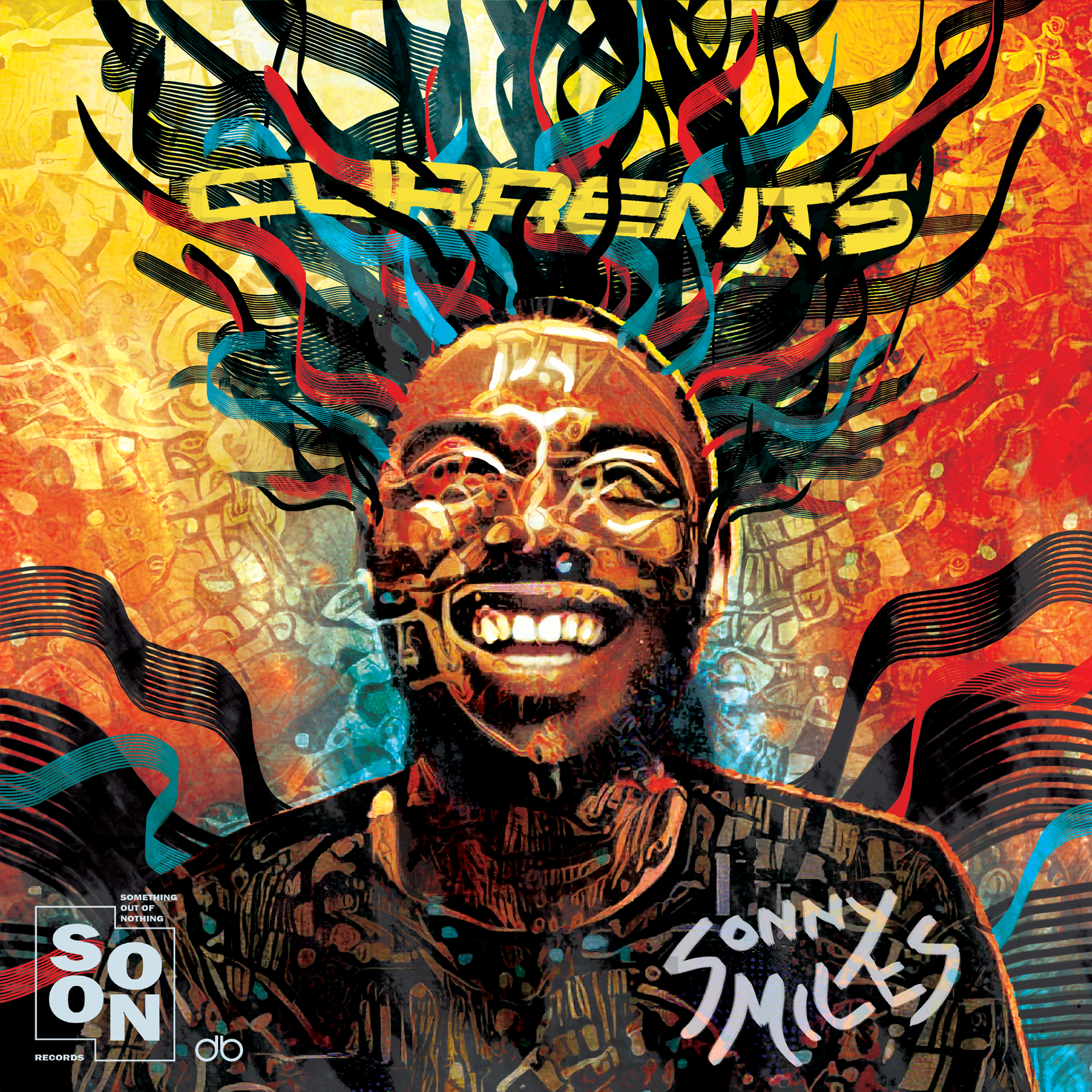
I partnered with the up and coming musician, Sonny Miles, for a series of both album covers and promotional material for Instagram.
Currents: promo art #1
For Miles' single, Currents, which is available on Spotify and Apple Music, I created a series of three pieces for promotion on Instagram. These were posted during the course of the week prior to the single's release. Miles wanted an Afrofuturistic aesthetic for these, so I kept that in mind as I designed. I reference a classic Jimi Hendrix poster with the cord-like hair that spirals out of his head, and the foundation is meant to reference Afrofuturistic art.
Adobe Photoshop
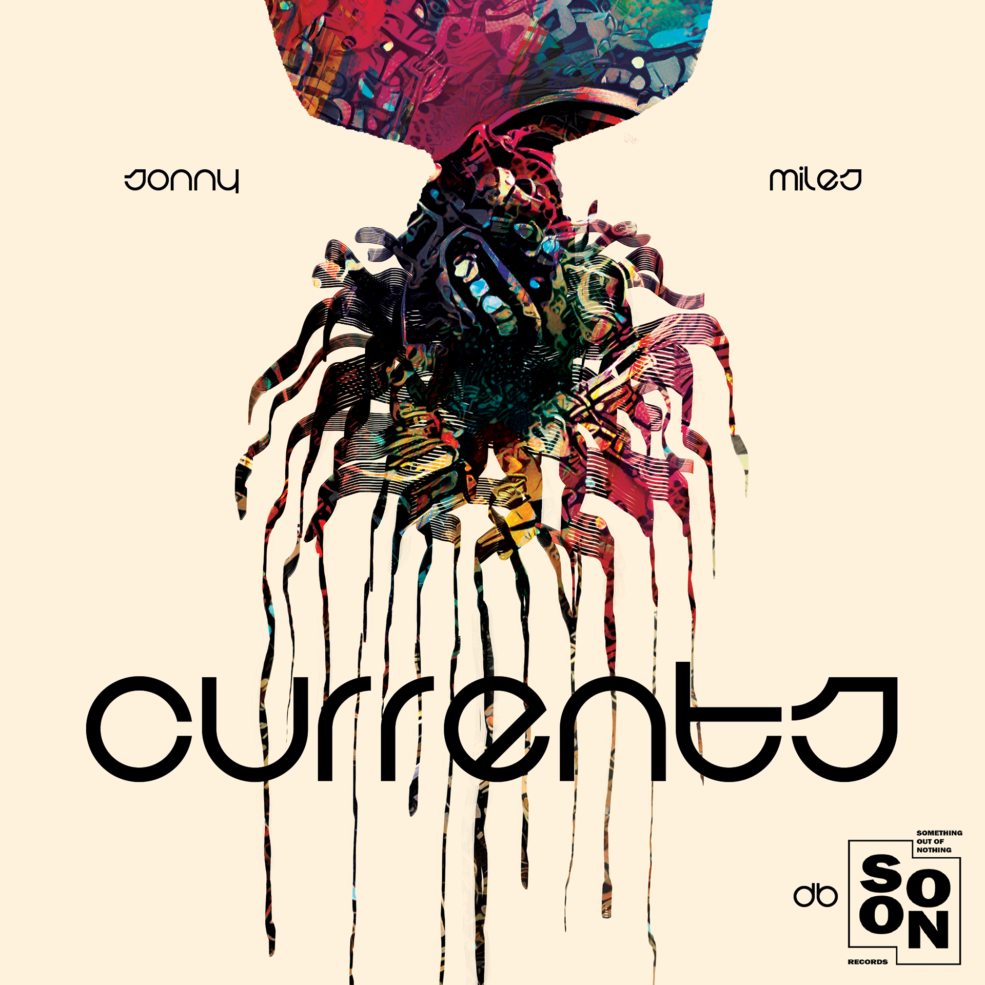
Currents: Promo art #2
Here I took a different approach to Afrofuturism. The image above is actually the same as in the first, except I chose to use the silhouette as a mask for the art, instead of painting it in. I chose the typeface based on its interaction with the spindles of hair dripping down behind it.
Adobe Photoshop
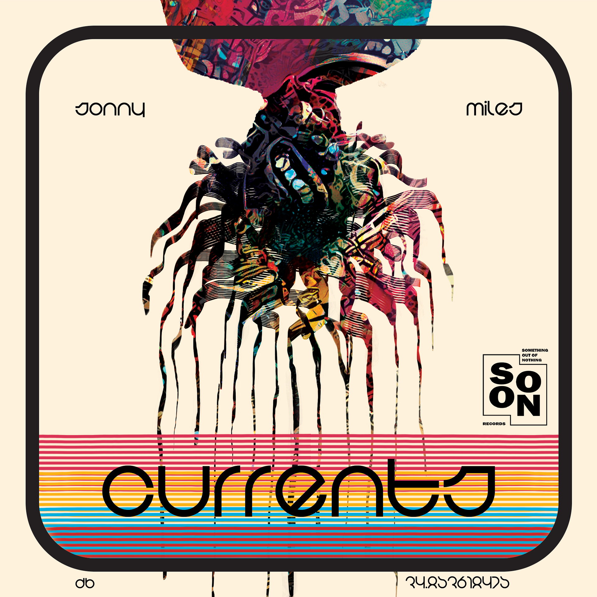
Currents: Promo art #2.5
This is a more fleshed out version of the graphic above it. In my eyes, this is the complete evolution of my concept, and thus my "final" draft. I combine Afrofuturism with a splash of retro, since Miles' music often has a retro feeling to it. I thought the retro framing played well with the "futuristic" typeface and the abstract art.
Adobe Photoshop
Cheese: promotional art
An early draft of the final product, I allowed Miles to use this as promotional material for Instagram, since he asked to. Comparing the final version below to this one, I'm sure you can see how the handwritten aspect came into being for the final; I simply used the type layer I organized above, by individually sizing and placing words, as a template to later write on top of. This was my plan from the beginning, but first I wanted to see what it would look like with a typeface (after all, I just did all that work anyways, right?). Miles' only design request for this single was that I use the words from the second verse, which were the most important to him and the ultimate meaning behind the song.
Adobe Photoshop
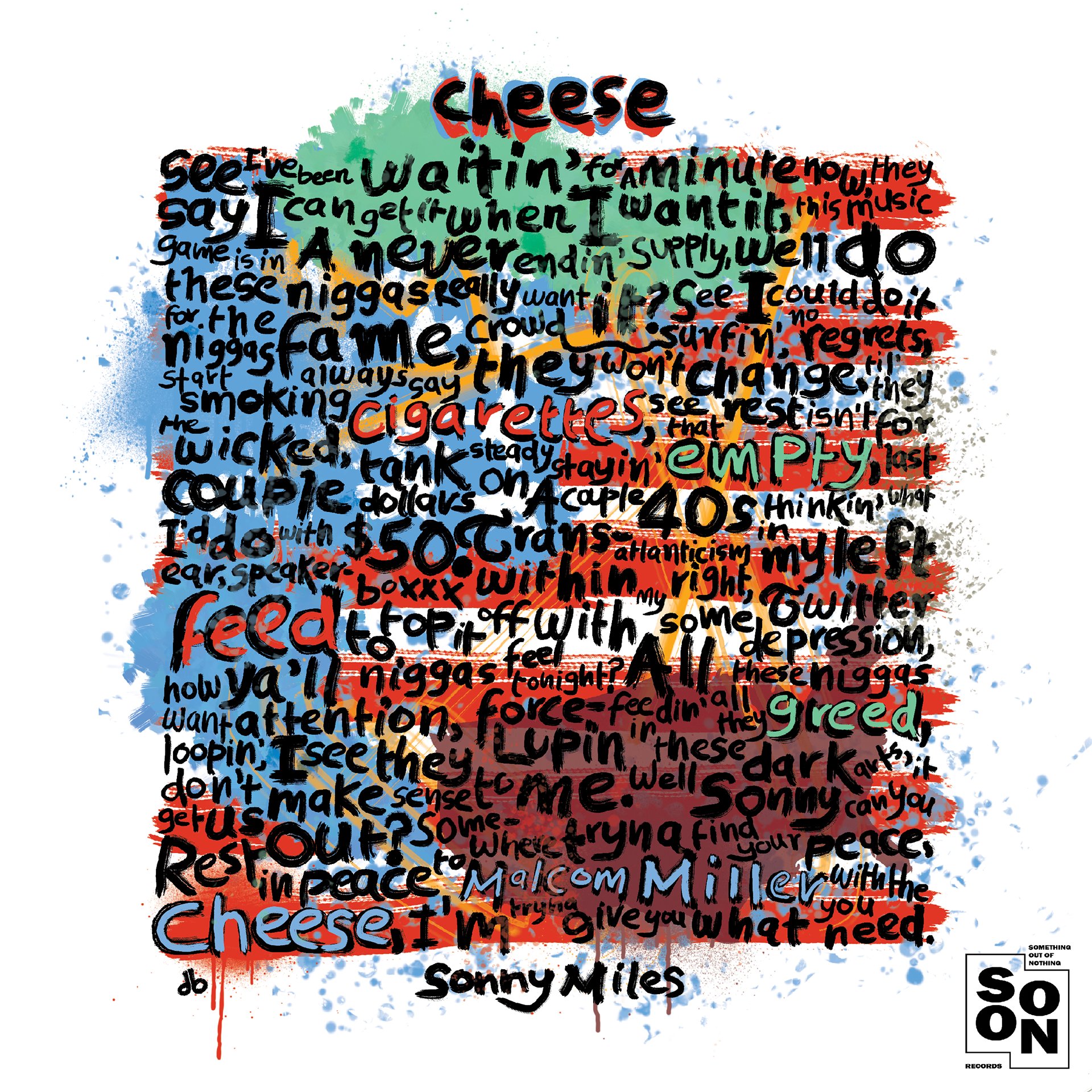
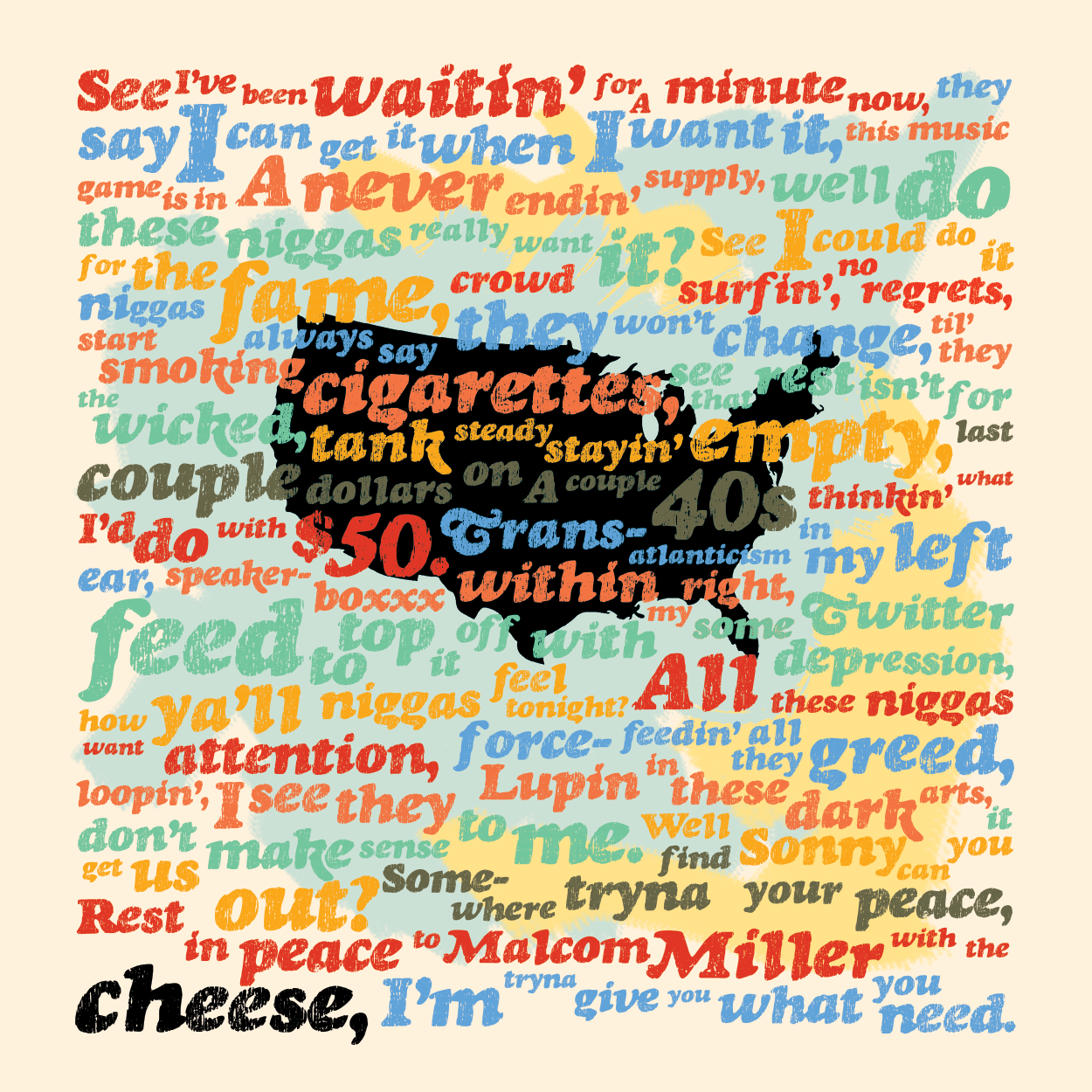
Cheese: finished album cover
Drawing some inspiration from Basquiat, I wanted this cover to be a bit messy. I also wanted the typography to become the composition itself, so I tried to leave as little unused space between words as I could. The background emulates the American flag, and the shape of the continental US is also "hidden" in the composition. The words were losing some of their effect, so I added in blocks of solid color to redirect some focus to the words themselves, and also highlighted over some in color for the same effect. This is the actual cover for the single, so if you looked for the single on Spotify, this is what you would see.
Adobe Photoshop